已经有了各省的数据,如何将信息以可视化的方式显示在地图上?顺便问一下python有相关的第三方包没? |
您所在的位置:网站首页 › pyrhon 数据可视化 › 已经有了各省的数据,如何将信息以可视化的方式显示在地图上?顺便问一下python有相关的第三方包没? |
已经有了各省的数据,如何将信息以可视化的方式显示在地图上?顺便问一下python有相关的第三方包没?
|
Python有很多优质地图可视化第三方包,本文罗列9个,有帮助记得文末点赞❤️  排名部分先后 Echarts/pyechartspyecharts擅长商业交互可视化,地图是其重要一部分,有大量demo,代码拿来即可用。 上demo 三维动态世界地图  世界航线图  bus路径图  中国地图 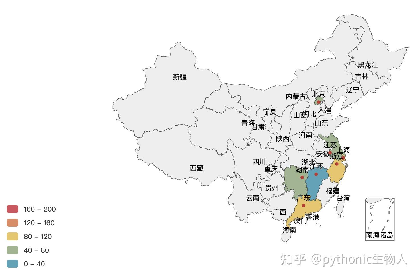  纽约街道数据  Kepler.gl Kepler.glkepler.gl为Uber开源的用于大规模地理空间数据集的可视化探索工具,可在Jupyter Notebook中使用, 上demo        Basemap BasemapBasemap为地理空间数据可视化利器,偏学院派。举个栗子,我们生活的蓝色星球全貌, import pyproj import geos from mpl_toolkits.basemap import Basemap # Basemap依赖pyproj和geos,三者一起导入,不然报错 import matplotlib.pyplot as plt plt.figure(dpi=150,figsize=(6,6)) m = Basemap( projection='ortho', #指定投影方式ortho lat_0=0, lon_0=140, #设置投影中心 resolution=None #设置分辨率 ) m.bluemarble(scale=0.5) #设置蓝色弹珠 (The Blue Marble)背景 plt.show(); 更多栗子, 更多栗子,   Folium FoliumFolium是Python数据处理优势和JavaScript地图库Leaflet.js地图可视化优势的完美结合,二者结合后即可绘制优美的交互式地图。 一些栗子~ import folium whm = folium.Map( location=[30.5538, 114.31589], #武昌区经纬度 zoom_start=10, # 默认放大倍数 ) folium.Marker( #添加位置标示 location=[30.5538, 114.31589], popup="❤️武汉", icon=folium.Icon(color="#ba2f2a", icon="info-sign"), ).add_to(whm) folium.CircleMarker( #圈地 location=[30.5538, 114.31589], radius=100, #圈半径 color="#c72e29", fill=True, fill_color="#c72e29", ).add_to(whm) folium.Marker( location=[30.34653, 114.27001], popup="❤️", icon=folium.Icon(color="blue", icon="info-sign"), ).add_to(whm) folium.CircleMarker( location=[30.34653, 114.31001], radius=100, color="#01a2d9", fill=True, fill_color="#01a2d9", ).add_to(whm) whm 再举个栗子, Heatmap, # Heatmap import numpy as np import folium from folium.plugins import HeatMap data = (np.random.normal(size=(50, 3)) * np.array([[1, 1, 1]]) + np.array([[39.904989, 116.4052859, 1]])).tolist() m = folium.Map([39.904989, 116.4052859], zoom_start=6) HeatMap(data, radius=20).add_to(m) m Minicharts  Marker   ImageOverlay  choropleth 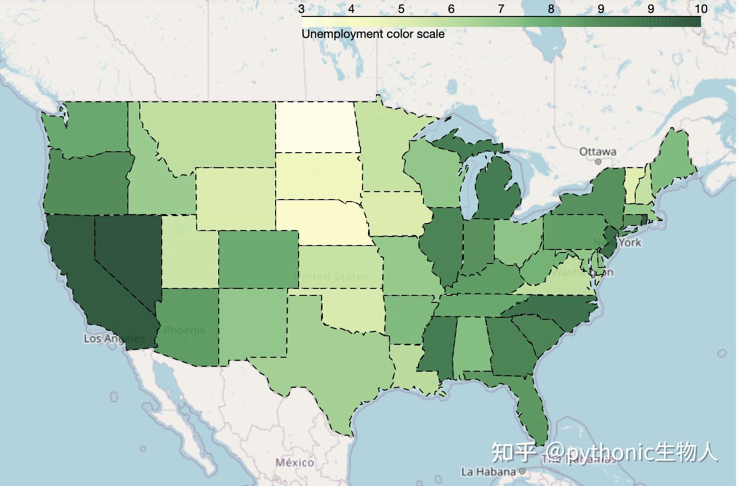 Heatmap with time  MiniMap  除此之外,Folium还有很多的插件 ipyleafletipyleaflet为Jupyter Notebook的一个扩展,擅长交互式地图, 安装 pip install ipyleaflet jupyter nbextension enable --py --sys-prefix ipyleaflet举个栗子, from ipyleaflet import Map, MagnifyingGlass, basemaps, basemap_to_tiles m = Map(center=(30.5538, 114.31589), zoom=1.5) topo_layer = basemap_to_tiles(basemaps.OpenTopoMap) magnifying_glass = MagnifyingGlass(layers=[topo_layer]) m.add_layer(magnifying_glass) m 更多栗子, 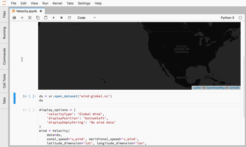  进一步学习:https://github.com/jupyter-widgets/ipyleaflet/tree/stable CartopyCartopy为Basemap的继承者。 安装 brew install proj geos #安装依赖 pip install cartopy -i https://pypi.tuna.tsinghua.edu.cn/simple #清华源光速安装举个栗子, 路线图, import cartopy import matplotlib.pyplot as plt plt.figure(dpi=150) plt.rcParams['font.sans-serif'] = ['Arial Unicode MS'] ax = plt.axes(projection=ccrs.PlateCarree()) #默认投影PlateCarree ax.stock_img() x_lon, x_lat = -55, -10, wh_lon, wh_lat = 114.30943, 30.59982 plt.plot( [x_lon, wh_lon], [x_lat, wh_lat], color='#dc2624', linewidth=1, marker='o', transform=ccrs.Geodetic(), ) plt.plot( [x_lon, wh_lon], [x_lat, wh_lat], color='#01a2d9', linestyle='--', transform=ccrs.PlateCarree(), ) plt.text(x_lon - 3, x_lat - 12, 'xx市', horizontalalignment='right', transform=ccrs.Geodetic()) plt.text(wh_lon + 3, wh_lat - 12, '武汉', horizontalalignment='left', transform=ccrs.Geodetic()) 更多栗子,    交互图  风杆图   geopandas geopandasgeopandas依赖pandas、fiona及matplotlib「GeoPandas是Pandas在地理数据处理方向的扩展,使用shapely地理数据分析、fiona执行地理数据读取、matplotlib执行绘图」。举几个栗子~ import matplotlib.pyplot as plt import geopandas #读入数据 world = geopandas.read_file(geopandas.datasets.get_path('naturalearth_lowres')) cities = geopandas.read_file( geopandas.datasets.get_path('naturalearth_cities')) #画图 fig, ax = plt.subplots(2, 1, dpi=200) world.plot(column='pop_est', cmap='Set1_r', ax=ax[0]) world.plot(column='gdp_md_est', cmap='Set1', ax=ax[1]) plt.show() 更多例子,如Plotting with CartoPy  Choro legends  kdeplot  geoplot geoplotgeoplot是一个high-level的Python地理数据可视化工具,是cartopy和matplotlib的扩展,geoplot 之于cartopy,犹如seaborn之于matplotlib.直接看demo:桑基图 \(Sankey)  添加散点  添加核密度估计图  分级统计图  Plotly/plotly-express Plotly/plotly-express专业的交互式可视化工具,在Python、R、JavaScript方向都有API,  快速入门:❤️快速上手plotly-express❤️ subplots   scatter   Marker/Line   choropleth   Density Heatmap  facets  ❤️更多精彩欢迎关注 @pythonic生物人 |
【本文地址】
今日新闻 |
推荐新闻 |